![]()
![]()
![]()
![]()
…a house is not a home until you love where you live…

Neutral or Bold: What Interior Style Is Best for the Long Haul?
You know what materials, finishes, and fixtures you want for your home…now you just need to choose a color palette for your new space. The problem is, you can’t decide whether to go neutral or bold.
On the one hand, you’ve always wanted to give your home more personality. On the other, the calming power of neutral tones is undeniable.
Though there’s no right or wrong answer, certain characteristics of a space can tell you whether it makes more sense to go neutral or bold.
On that note, here are a few key factors to consider when choosing the color palette for your design project:
Purpose of the Space
The purpose of a space can point you towards an appropriate color scheme. Think about the kind of atmosphere you’re trying to create: Do you want the space to be quiet and relaxing, or do you want it to be more busy and lively?
For example, let’s look at bedrooms – do you want it to shed your stress and enjoy the tranquility when you’re in there? Then neutral tones make perfect sense. Conversely, the vibrancy of bold colors fits naturally in busier social spaces like living rooms or kitchens. That’s why it’s en vogue to see rich colored cabinets in kitchens and bright statement pieces in living rooms. The happy, energetic vibe is welcoming in the right places.
Size of the Space
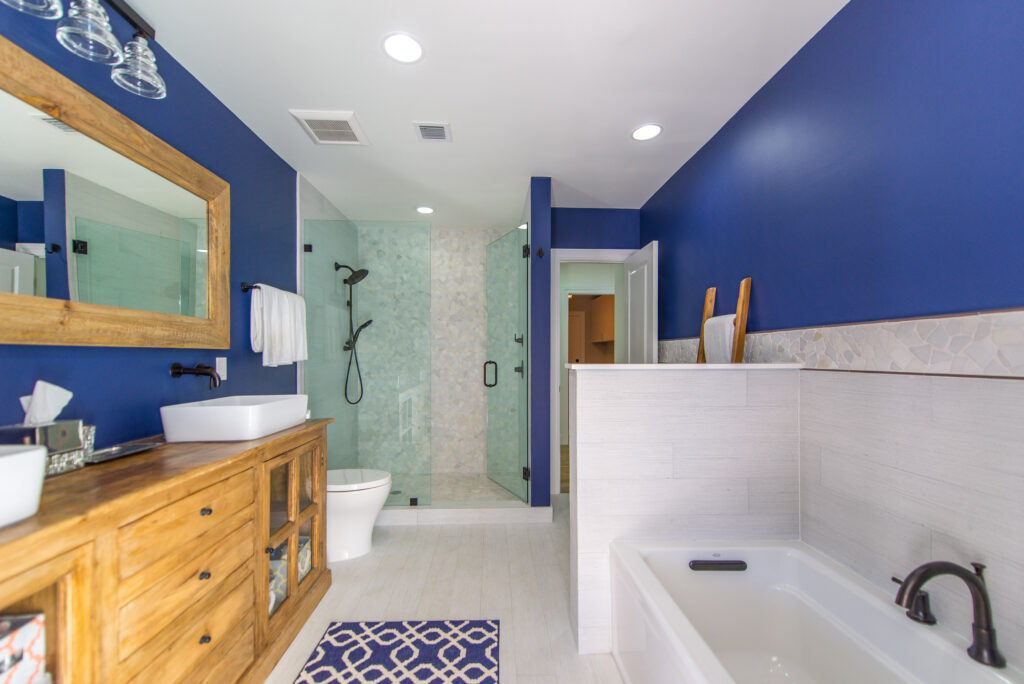
Smaller spaces like studies, powder rooms, or even bathrooms are perfect for bold colors. Since there’s less space to work with, you can use a bold color like an earthy red, a deep blue or a muted green for the walls without creating an overpowering experience. Yes, the color certainly makes an impact, but because it’s so different from the rest of the house, it feels more refreshing than overwhelming.
In fact, you could even go monochromatic with your favorite bold color in a smaller, discreet space. For instance, you could paint your library a deep navy blue. When the walls, ceiling, trim, and cabinets are all the same color – and the room isn’t too big – the cohesive palette creates a cozy, calming vibe
Amount of Lighting
Another key factor is the amount of lighting your space gets. An abundance or absence of natural light can significantly affect the appearance of a certain hue, so much so that it looks like an entirely different color altogether.
The reality is that you have to play with bold and neutral colors and their lighting to find the right balance for you. There is no set formula for it – for some rooms in some homes, the bolder colors are amplified with extensive natural light and neutrals seem ‘too bright’ whereas you can find the same bold color with extensive natural light can make a room feel cramped in another home.
Not Sure? Start Small with Accent Items
If you can’t decide between neutral or bold, we recommend giving the space a neutral backdrop, since this can be paired with virtually any bold color.
For example, you could paint the majority of your kitchen cabinets the perfect shade of white, but paint the cabinets in the island a stunning royal blue. The island would become the focal point, but the lightly colored walls, chairs, table, and countertops maintain a calming, serene vibe.
Likewise, you could also use bold colors for accent items like pillows, ottomans, and of course, accent chairs. Just give the space a neutral backdrop, and you’re essentially free to use whatever shade of blue, pink, yellow, purple, or green you wish and it won’t seem out of place. On the contrary, the soft, airy background will create a sense of balance and warmth.
Feeling inspired by these color palette ideas? When you’re ready to design a space that’s just as inviting as it is unique, the Debowsky Design Group is happy to help. We’ll listen to you, understand your vision, and show you how to incorporate your favorite shades to achieve the style you have in mind.
Whether it’s a renovation, remodel, or full-blown new construction, give us a call and we’ll get your project underway.