![]()
![]()
![]()
![]()
…a house is not a home until you love where you live…
Our Favorite Colors to Incorporate Into Your Home in 2023
Our color theme for 2023 is Bright and Airy! While we love a good moody room, we’re ready for some levity. Let in the light and bright colors this year to allow us to see our homes as the respites they truly are. We’re aiming for the early summer feeling of pure freedom F. Scott Fitzgerald captured in the beginning of The Great Gatsby:
“A breeze blew through the room, blew curtains in at one end and out the other like pale flags…” We want to feel like Daisy did in that moment, paralyzed with happiness!
Warm Whites and Creamy Neutrals
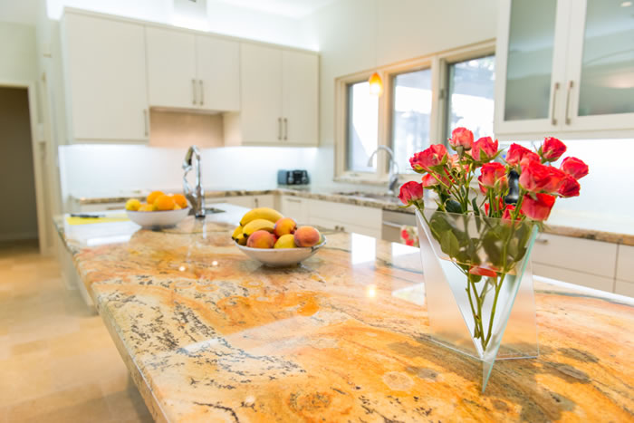
It might seem like recommending “whites” is simple, but the effect of stark white vs warm white is very different. Creamy neutrals bring even more warmth and manage to be both bright and cozy. Keeping most walls in a shade of white is great if you love to decorate. It provides a great background and helps art show off. It also gives you the feeling of crisp, clean linens.
If you have a room painted in a darker color, you can lighten the feel of the space with white and light neutral accents. White furniture, for example, in a navy room looks really sharp and timeless. If you’re ready for something a little unconventional try a warm, pure white and repaint the trim and doors in a dark color. Black is the most neutral dark trim color, but the deepest shades of navy and hunter green could also look amazing.
White Flour (SW7102)
Rivers Edge (SW7517)
Cool Blues and Spring Leaf Greens
The right blues and greens give your home the feel of bringing the outside in. These colors work wonderfully on their own or together. This year we’re thinking of blues that remind us of cool, clean water. Picture a perfect pool, or a waterfall, or imagine the feeling of running through a sprinkler on a hot day. Greens the color of new leaves – a little lighter than they will be when they mature, and softer.
These colors are both very calming even if you go for it and paint more than one room completely. Of course, accent walls are always an option if you prefer just a touch of color.
Green and blue accents used together go beautifully in spaces that are mostly neutral. They will also give the bright and airy look of the year as accents in a pale-yellow room.
Porch Ceiling (SW9063)
Picnic (SW6731)
Buttery Yellows and Sun-washed Corals
We don’t always think of colors in the warm spectrum when we picture “bright and airy.” But that doesn’t mean they can’t fit into this theme! These colors are like warm afternoon sunshine on a cool day.
Painting walls in these colors will create a cozy space. Yellow and coral or orange tones change with different lighting more obviously than most other colors. So, the color will almost seem to change throughout the day. A yellow room that is bright and shiny in the middle of the day will slowly shift to feeling like the inside of a lantern as the sun goes down.
Yellow shades are wonderful as accents with blues. Corals and oranges coordinate well with light greens, but also work with blues. Of course either of them, or both together, would work well as accent shade in a white room.
Lemon Chiffon (SW6686)
Youthful Coral (SW6604)
You can search for each of the mentioned paint colors by name or reference number. The Sherwin Williams site is a great resource for previewing paint colors and creating color palettes. It is always a good idea to get a sample of the paint you think you want in the finish you prefer. The same color will have a different appearance in semi-gloss than it does in eggshell. Feeling inspired? If you’re ready to make some changes, we can help! Schedule your consultation today!